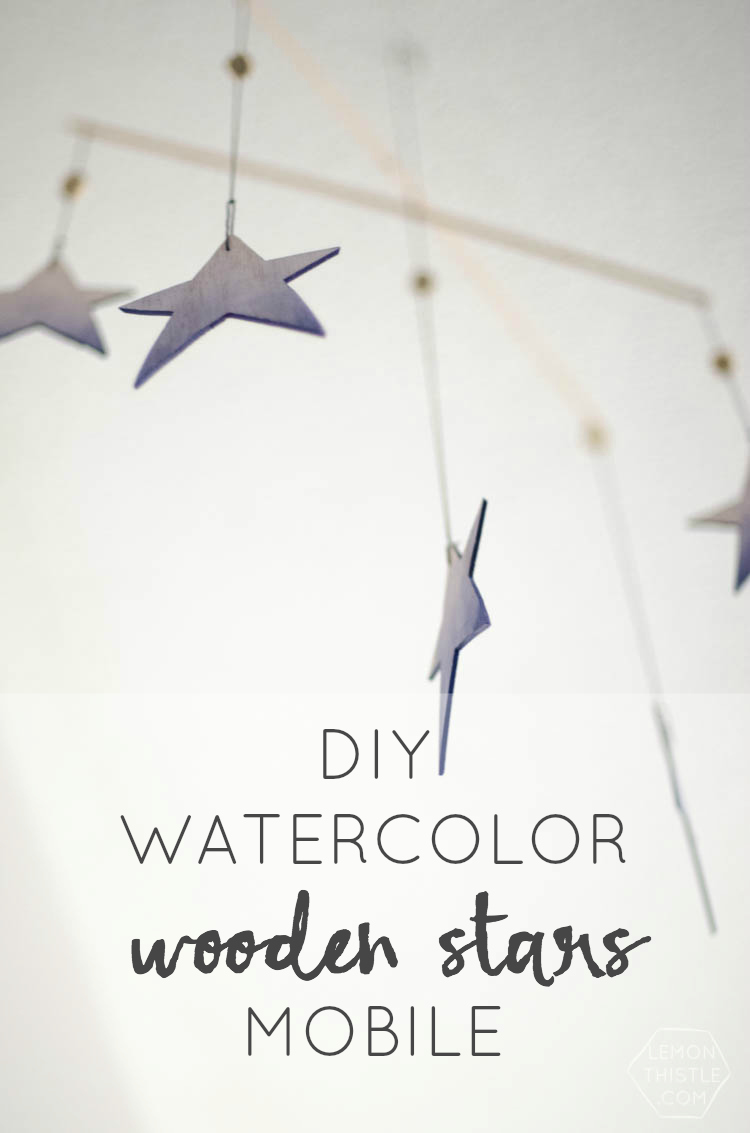
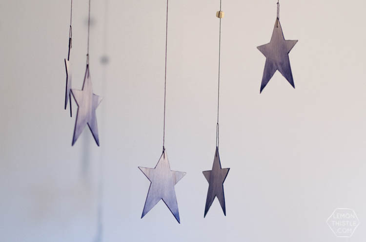
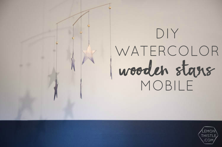
Did this week fly by for anyone else? Since I was sick last week, I feel like I’m playing catch up and this week disappeared before my eyes! We’re busy working hard to finish up our bathroom update to send over to Remodelaholic this weekend (woohoo!) so I thought I’d share a project I created a little while back for The Little Umbrella. We have been slooow moving decorating our home- the renovations have kept us busy enough, but this watercolor wooden star mobile makes me feel like my kiddos have a real nursery- not just a room with cribs. I almost didn’t make this (last summer) because I thought they were too old, but I wanted to have a mobile in their nursery so gosh-darn-it I went ahead and made one anyways. And I love it- so it all worked out.
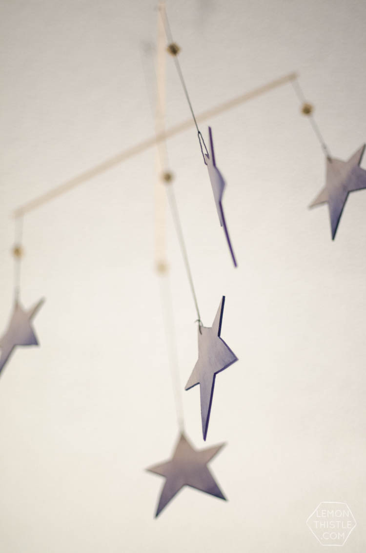
This mobile is lightweight, so it bounces around so nicely! By painting the edges of the wooden stars, it’s really fun to look at as it dances- not that I spent a bunch of time watching it or anything.
To make your own, you’ll need:
- Balsa Craft Wood Sheets 3/32″ Thick x 4″ Wide (For the Stars)
- Balsa Craft Wood Strips 3/32″ Thick x 3/16″ Wide (For the Mobile)
- Cutting Mat
- Craft Knife
- Awl (Pointy Screwdriver)
- Charcoal or Navy Embroidery Thread
- Navy Acrylic Craft Paint and Water
- Fan Paint Brush
- Small Flat Paint Brush
- Clear Sealer Spray (Satin Finish)
- Wooden Beads
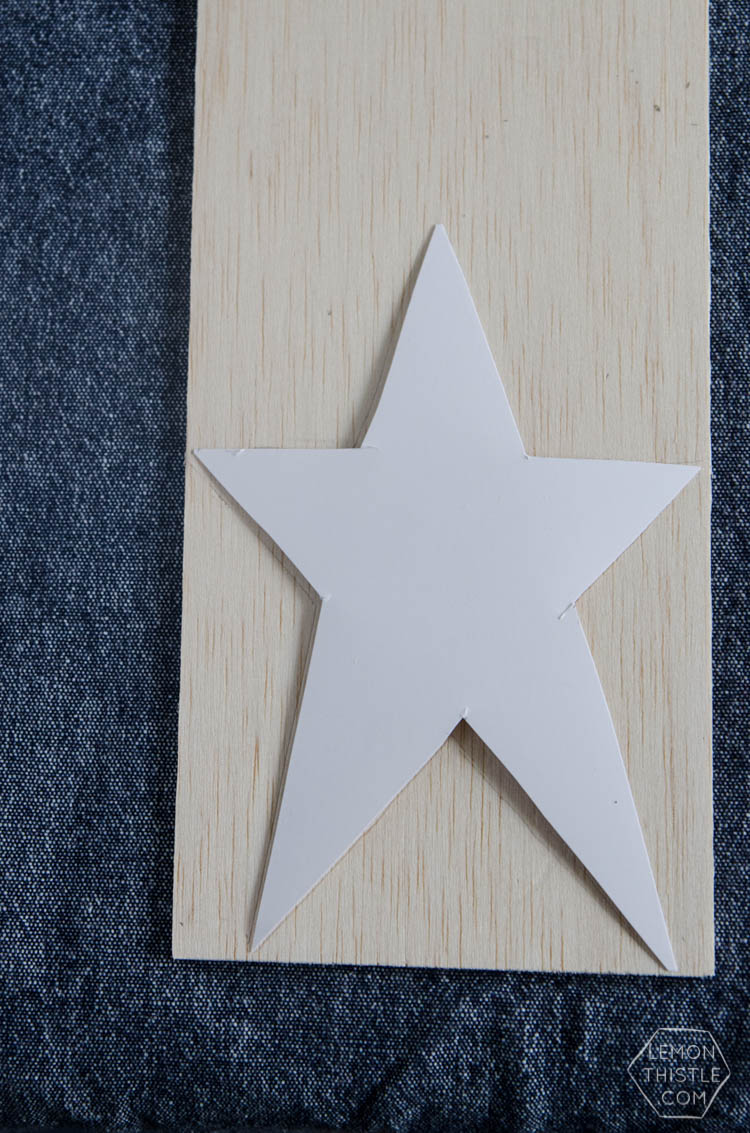
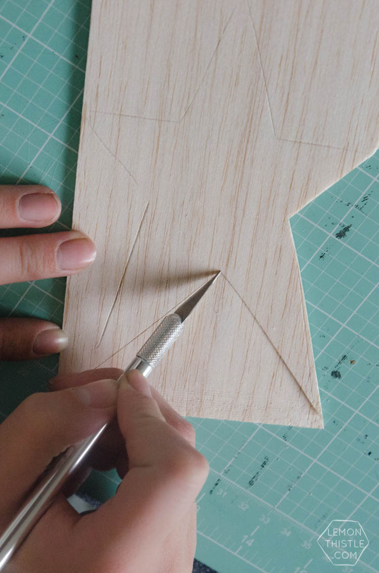
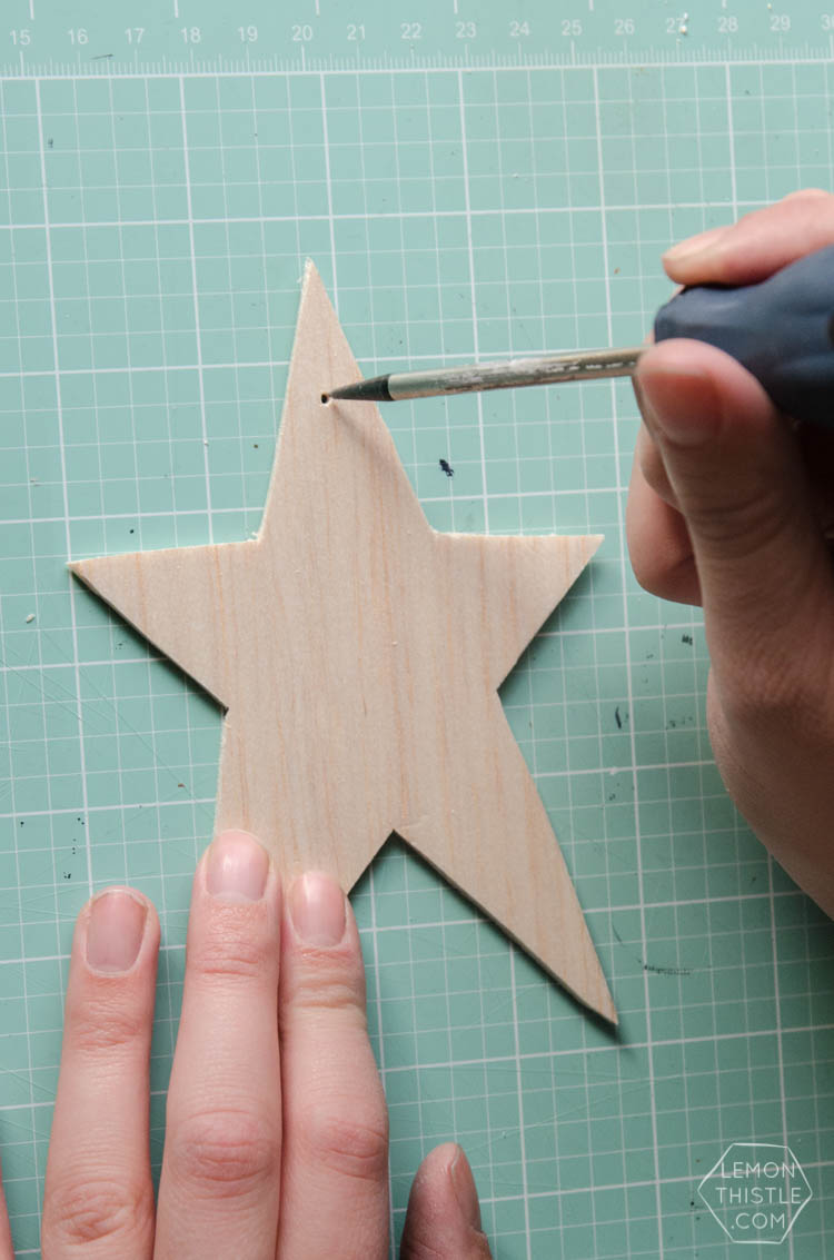
Start by drawing out a star template. You could free-hand, or find a template you like online. Lightly trace this template onto your balsa wood sheets. While the concept would translate well to any shape, the stars are magical. I used a mechanical pencil and you don’t need to press hard to indent the balsa so make sure you trace super lightly! Start cutting out your stars using your craft knife. Press only gently and take a few passes to easily cut the Balsa wood. Then use an awl to gently punch the holes for your thread. Balsa wood is fantastic for crafts since you only need a craft knife to work with it. The only downside- it’s very delicate, so be gentle when cutting and punching to avoid breaking the pieces… I say that from experience (if you know what I mean).
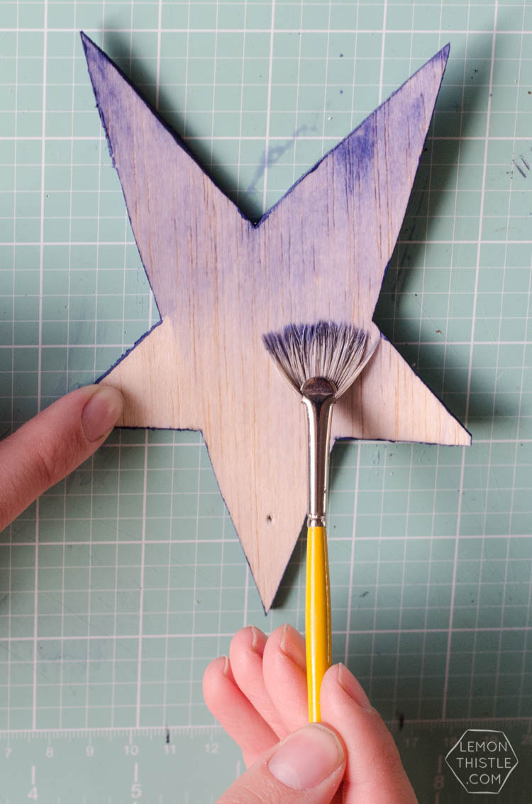
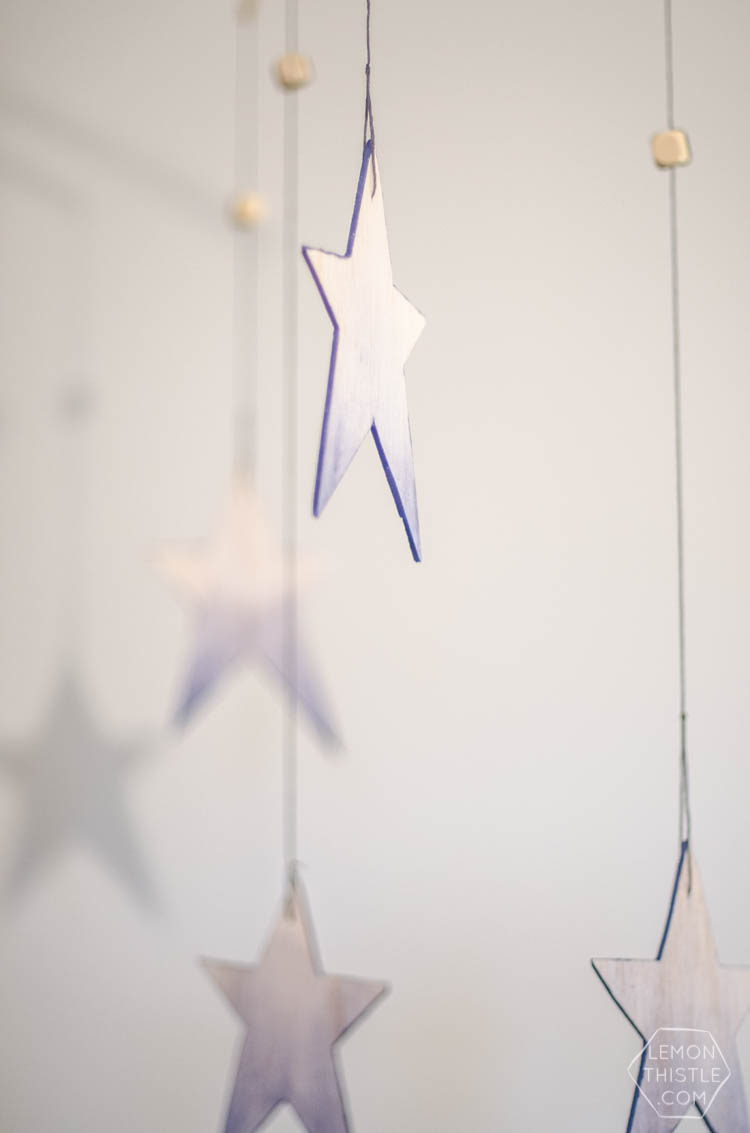
Once your stars are cut, you can get to painting! Start by painting the edges of your stars with full strength paint using a small flat brush. Next, move on to create the watercolor effect on the face of the stars. Dip your fan brush in water, then mixing with the acrylic paint, drag the fan brush until out of paint. Add more water as necessary to create a graded effect. Too much water can cause the soft wood to swell, so you may need to re-punch your holes for the thread.
When the paint is dry, mist a couple coats of a satin finish clear spray sealant over each side to protect the finish.
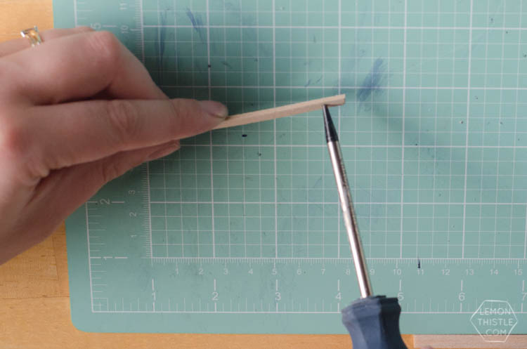
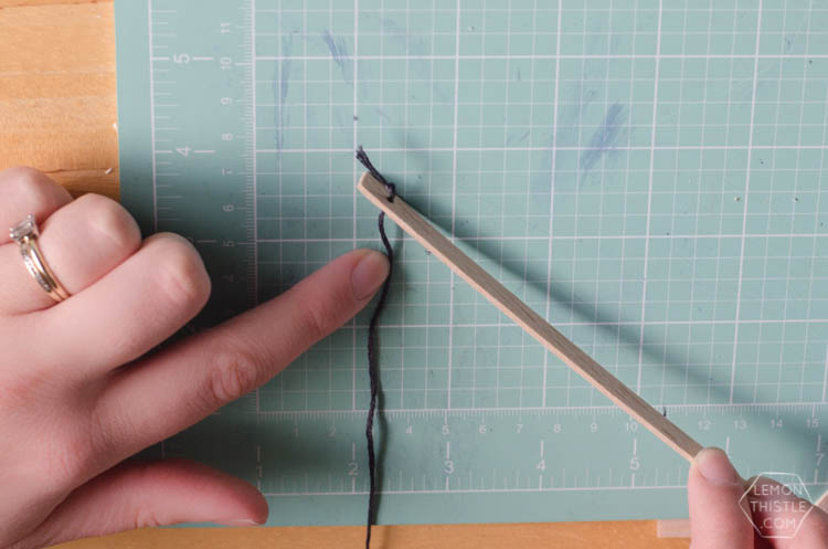
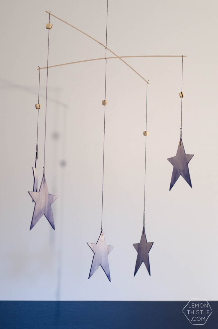
Decide how large you would like your mobile to be and cut your balsa strips accordingly. This is to make the assembly (or hanging pieces) of the mobile. Punch a whole in the centre of each strip as well as on each end. Then, cut embroidery thread to length (this will vary depending on the height of your ceiling) and feed the hanging thread through the holes. Taping the ends may help make this easier. Tie knots to secure the strips and strings in place. Taping your work-in-progress to a wall or window will help you keep the threads and wood strips organized while assembling.
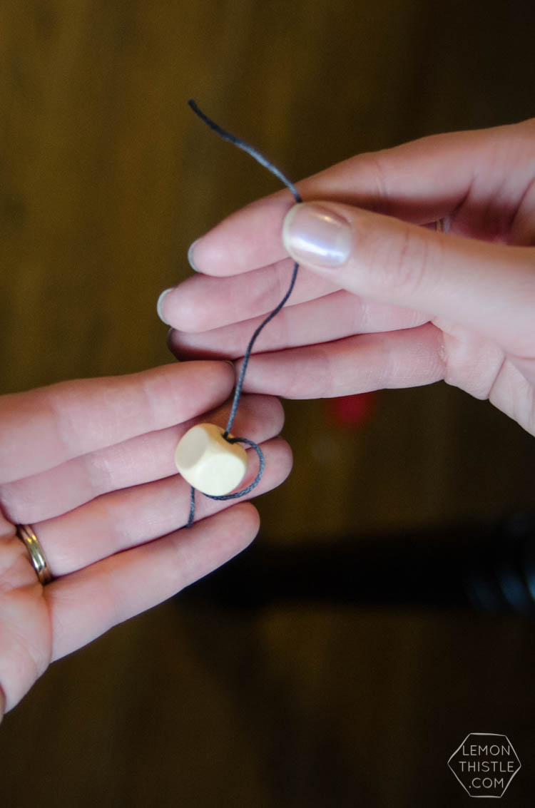
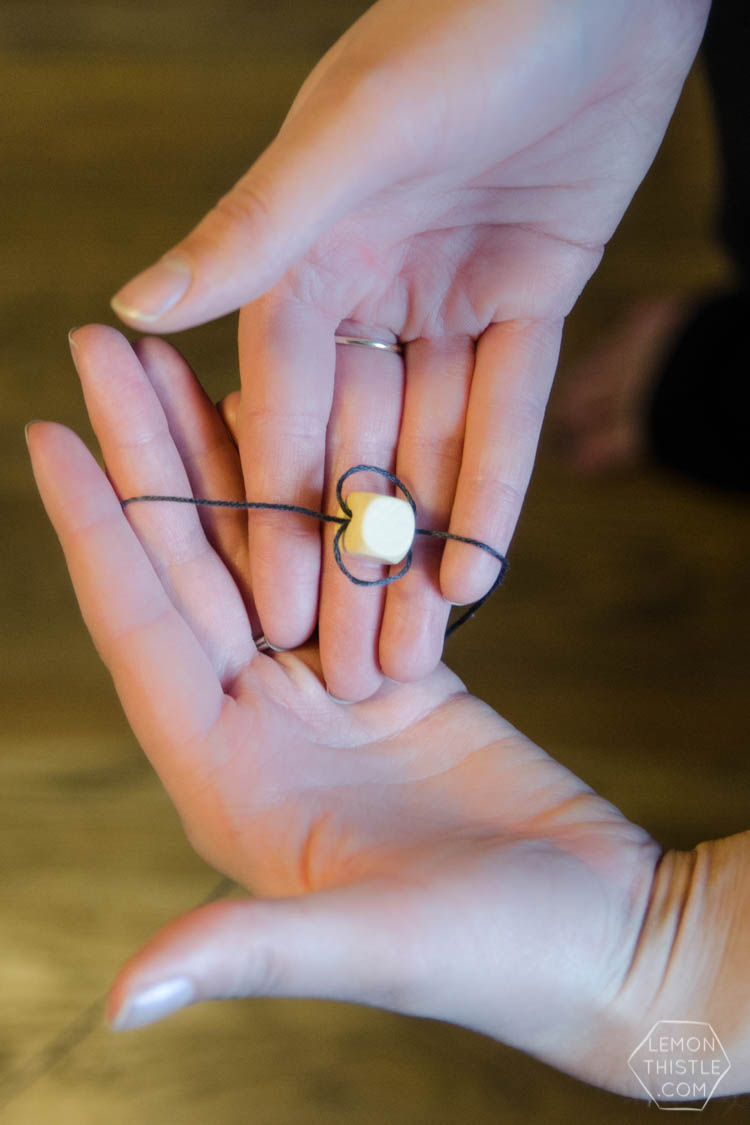
Next, thread on your wooden beads. These will help add weight to the mobile (balsa wood is very light). Adjusting the height of the beads will also help balance the mobile. Thread them on without tying knots by looping the thread back around twice (like in the photo).
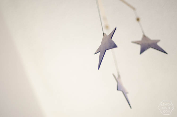
Once your wooden beads are in place, tie your stars in place. Once they are tied in place, you may need to adjust the height of the wooden beads again to balance the mobile. When you’ve balanced your mobile, you’re ready to hang it!
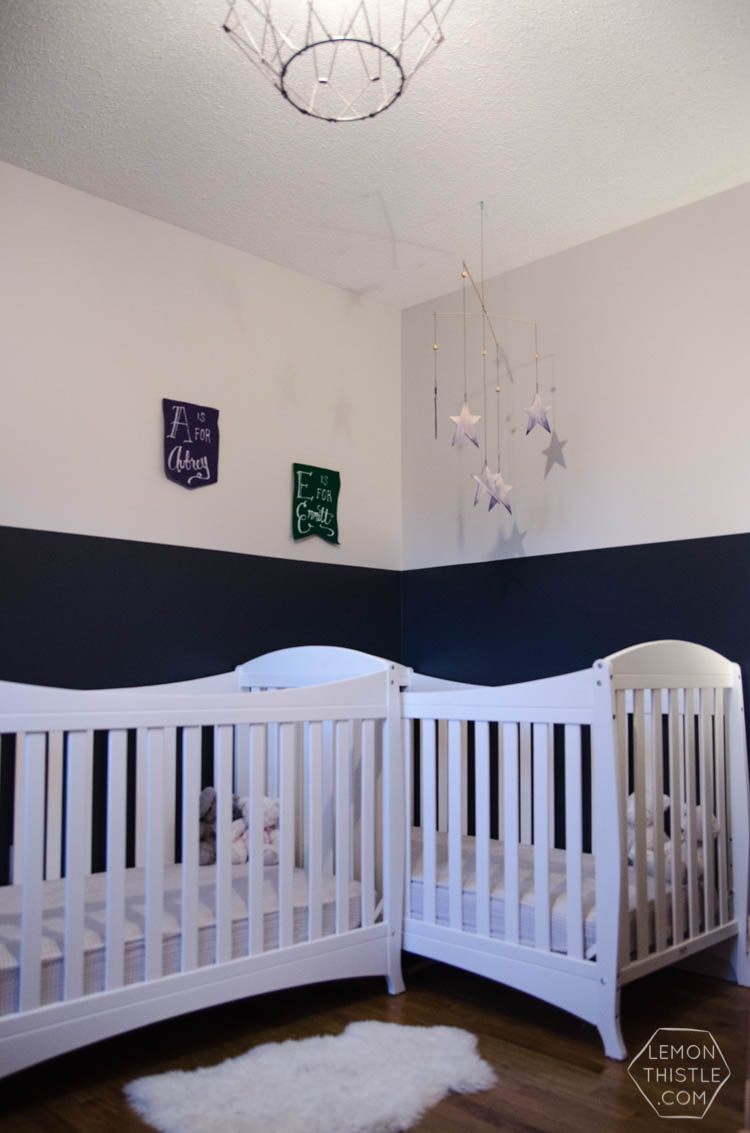
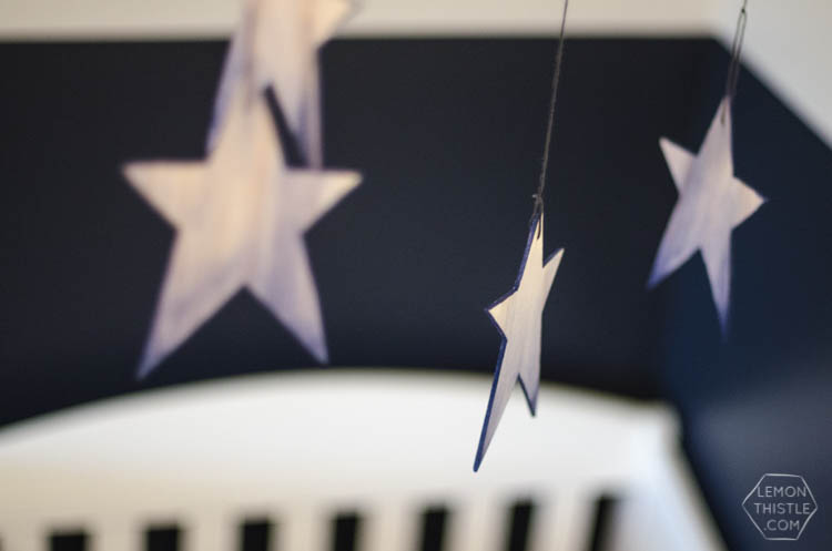
I’m so happy that I went ahead and made a mobile for the twins, I feel like a nursery NEEDS one, or am I crazy? I’m thrilled with the way it turned out, it fits perfectly with their two-tone navy walls. Also… can you spy the other decoration I’ve made for the babes’ room? Those felt banners! Good eye, friend, good eye. What has been keeping you busy this week? I’d love to hear from you!
 DIY Special Dates Pillow Cover
Leave a Reply